
In today’s fast-paced digital era, the dominance of mobile devices has reshaped the way we access information and interact with the online world.
With the increasing prevalence of smartphones and tablets, businesses and web developers must adapt to this paradigm shift. Enter responsive web design – a crucial approach that ensures websites adapt seamlessly to various screen sizes and devices.
In this blog, IT Companies in Europe – Saphiam Technologies will explore the significance of responsive web design in a mobile-first world and how it can positively impact user experience, SEO, and overall business success.
Before moving its crucial to under the following:-
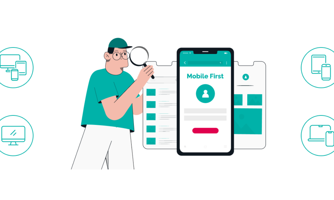
What is the Meaning of Mobile First World?
The term “mobile-first world” refers to the current state of the digital landscape, where mobile devices, such as smartphones and tablets, have become the primary means of accessing the internet and engaging with online content. In this context, “mobile-first” emphasizes the importance of prioritizing mobile users when designing and developing websites, applications, and digital experiences.
Continue with one of the best IT Companies in Europe – Saphiam Technologies.
Now,
Let’s Start the Topic:-
What is the Importance of Responsive Web Design in a Mobile First World?
Here is the importance that defines the worth of responsive web design for all the mobile-users:-
1. Catering to Mobile Users
Mobile devices have taken the lead as the primary means of accessing the internet. According to recent statistics, mobile traffic accounts for a substantial portion of global internet usage. Consequently, failing to prioritize mobile users can lead to a significant loss of potential customers and revenue. Responsive web design allows websites to adjust their layout, content, and functionality to fit any screen size, providing an optimized user experience for both desktop and mobile visitors.
2. Enhancing User Experience
User experience (UX) is a key determinant of a website’s success. Visitors expect a smooth and seamless browsing experience, regardless of the device they use. A responsive web design ensures that users can easily navigate through the site, read content, and interact with various elements without the need for zooming or excessive scrolling. By eliminating the frustration associated with non-mobile-friendly websites, businesses can increase user engagement and boost conversions.
3. Cost-Effectiveness and Maintenance
In the past, businesses used to create separate versions of their websites for desktop and mobile users.
This approach was time-consuming, expensive, and often resulted in inconsistent user experiences. With responsive web design, developers can build a single website that automatically adjusts to different screen sizes. This not only saves time and development costs but also streamlines maintenance efforts since updates only need to be made once, benefiting all devices.
4. SEO Benefits
Search engines, like Google, prioritize user experience and mobile-friendliness in their ranking algorithms. Websites that are not optimized for mobile devices often face lower search engine rankings, reducing their visibility and organic traffic.
A responsive web design is an SEO-friendly solution, as it consolidates all content under one URL, preventing issues related to duplicate content. Furthermore, when users have a positive experience on a website, they are more likely to stay longer, reducing bounce rates, which can further improve search rankings.
5. Adaptability to Future Devices
The technological landscape is constantly evolving, and new devices with varying screen sizes and resolutions will continue to emerge. Responsive web design is future-proof, ensuring that websites can adapt seamlessly to these devices without requiring further adjustments or redesigns. Embracing this approach allows businesses to stay ahead oaif the curve and remain relevant in an ever-changing digital landscape.
6. Brand Consistency
Consistency in branding and user experience is vital for any business. When users access a website on different devices and experience a consistent look and feel, it fosters trust and recognition. Responsive web design ensures that the brand message, design elements, and content remain cohesive across all platforms, reinforcing the brand’s identity and improving brand recall.
Conclusion
In the mobile-first world we live in, responsive web design is no longer an optional feature but a fundamental requirement for any successful online presence. By prioritizing the needs of mobile users and ensuring a seamless browsing experience, businesses can foster user engagement, boost SEO rankings, and build brand loyalty. Embracing responsive web design not only future-proofs your website but also showcases a commitment to delivering high-quality experiences, which can lead to long-term business success. So, don’t delay – make your website responsive today and reap the benefits in this ever-evolving digital landscape.
Make Saphiam Technologies Your Ideal Partner for Responsive Web Design for Mobile First Approach
When it comes to embracing the mobile-first approach through responsive web design, look no further than Saphiam Technologies. We take pride in our expertise in crafting seamless and engaging user experiences that cater to the needs of the mobile-first world. Our team of skilled and creative designers will ensure that your website looks stunning and functions flawlessly on any device, be it a smartphone, tablet, laptop, or desktop.
With a focus on user experience and SEO-friendly solutions, IT Companies in Europe – Saphiam Technologies guarantee that your website will not only captivate your audience but also rank higher in search engine results. Partner with Saphiam Technologies today and unlock the potential of a mobile-optimized website that will drive growth and success for your business.
Feel free to contact us now
Or
For more information, follow us today!